One of my new years resolution was to try to post more of my work in progress quilts. I found a great site called Freshly Pieced, that hosts a work in progress blog party (the link is on my sidebar) which will hopefully help keep my on track.
Today I have been working on a quilt I had an idea for a month or so ago. I wanted to use black and white fabrics, which I love, and pastels, which I am not too fond of. I wanted to see how/if they married.

I decided to use a wonky churn block with 4 1/2 inch pieces. I think the block is a little big and if I was going to do it again I would go for a smaller piece, maybe 3 1/2 inch pieces. I also decided to alternate light and dark blocks to give the quilt some pattern.

The blocks came have come together really quickly and I have just finished the quilt top this morning.
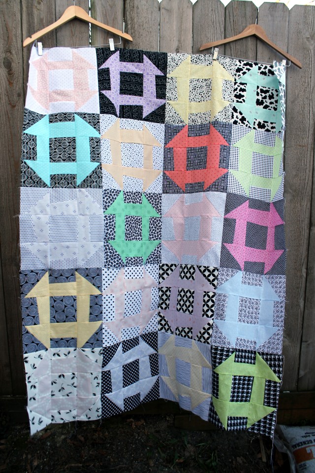
I am not thrilled with it, but it will make a good Project Linus quilt I think. I will now add it to the pile of quilt tops that need finishing.

I think one of the reasons you don’t like the quilt is that it isn’t wonky enough. But there are times when you just need to go with it, and in this case get it finished and out of the house to a good cause.
I think you have it. It is not wonky enough. I will have to try again with this pattern and really just let go. Thanks so much for your insight.
It looks like it was fun to do, and sometimes fun is what it is all about. I too give quilts to charity when I am less than happy with a design experiment. It will still keep someone warm. If you do this again, you might want to try putting darker pastels with the lighter black-and-white fabrics. There is so much room for experimentation with your start of pastel with B/W! Keep on having fun.
On second thought–after seeing the thumbnail, which is more like stepping back to get a distant view, the light B/W and light pastel create more of a checkerboard than they do up close.
The checkerboard effect was what I was looking for. I needed to get some sort of contrast into the quilt. I have the same issues when I do low volume quilts – I struggle to get excited about them because they are not loud and bright. I am working on changing my point of view but it is a slow process!
The real problem for me in designing is a light fabric that doesn’t read light because of dark print spots…they work so differently from true lights…I haven’t tried “low volume” yet; adding it to list…
I would recommend low volume. I found it a challenge but I loved the results. I am in the process of quilting my low volume log cabin and I am really pleased with how it turned out. It
I always have trouble getting my wonky blocks to end up wonky enough. I also am rather bored with pastels, but this certainly seems like a way to make them more interesting!
I love this design! I think it would be nice in all solids. It is a classic quilt block made modern with your choice of fabrics! Great job! Someone will love it.
I like it, the best blocks for me are those with the darker background.
I think this is a great quilt and love how you used black and white as the background for the pastels!!