A couple of days ago I realized that January was slowly slipping away and I had not managed to tick any projects off my 2014 To Do List. Drastic action was needed so I pulled out my Tula Pink blocks and got to work. I made the final couple of blocks, put them up on the design wall and stared at them for a day (very constructive use of time I hear you say).
I blame my husband for the delay, actually I blame him for a lot of things, but this was really his fault. You see last year when I started this project he did this…
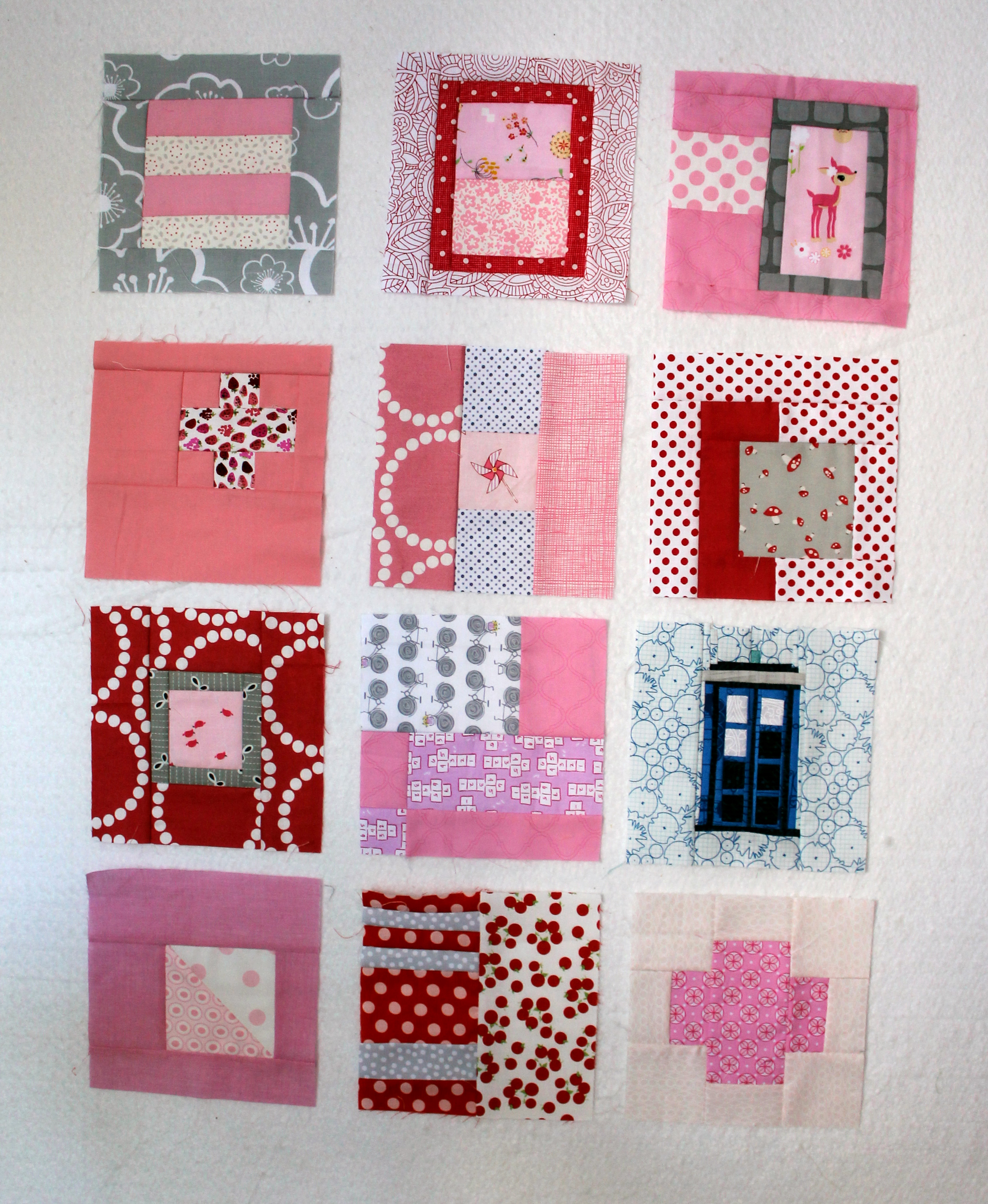
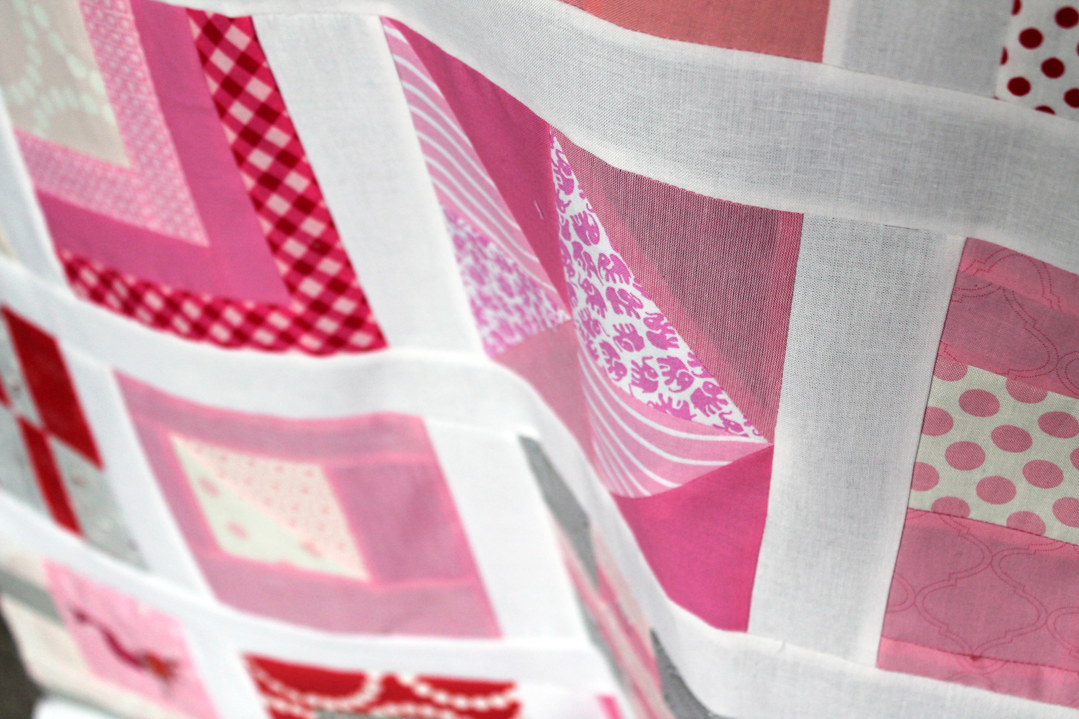
It made me laugh at the time but when it came time to put the top together using just pink blocks something seemed to be missing. The layout with the Tardis was fun but it took away from the Tula Pink feel of the quilt. I then made this…
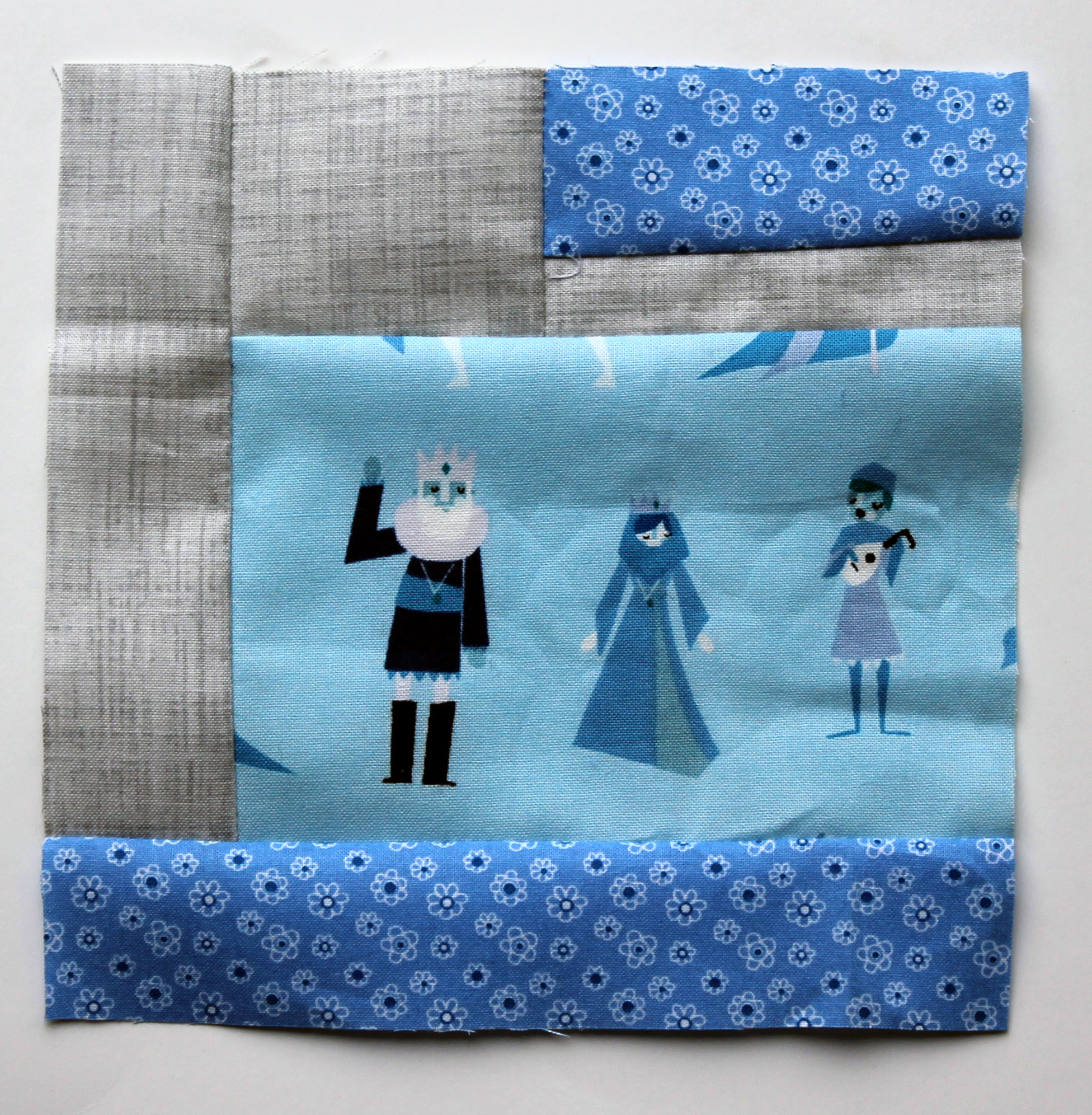
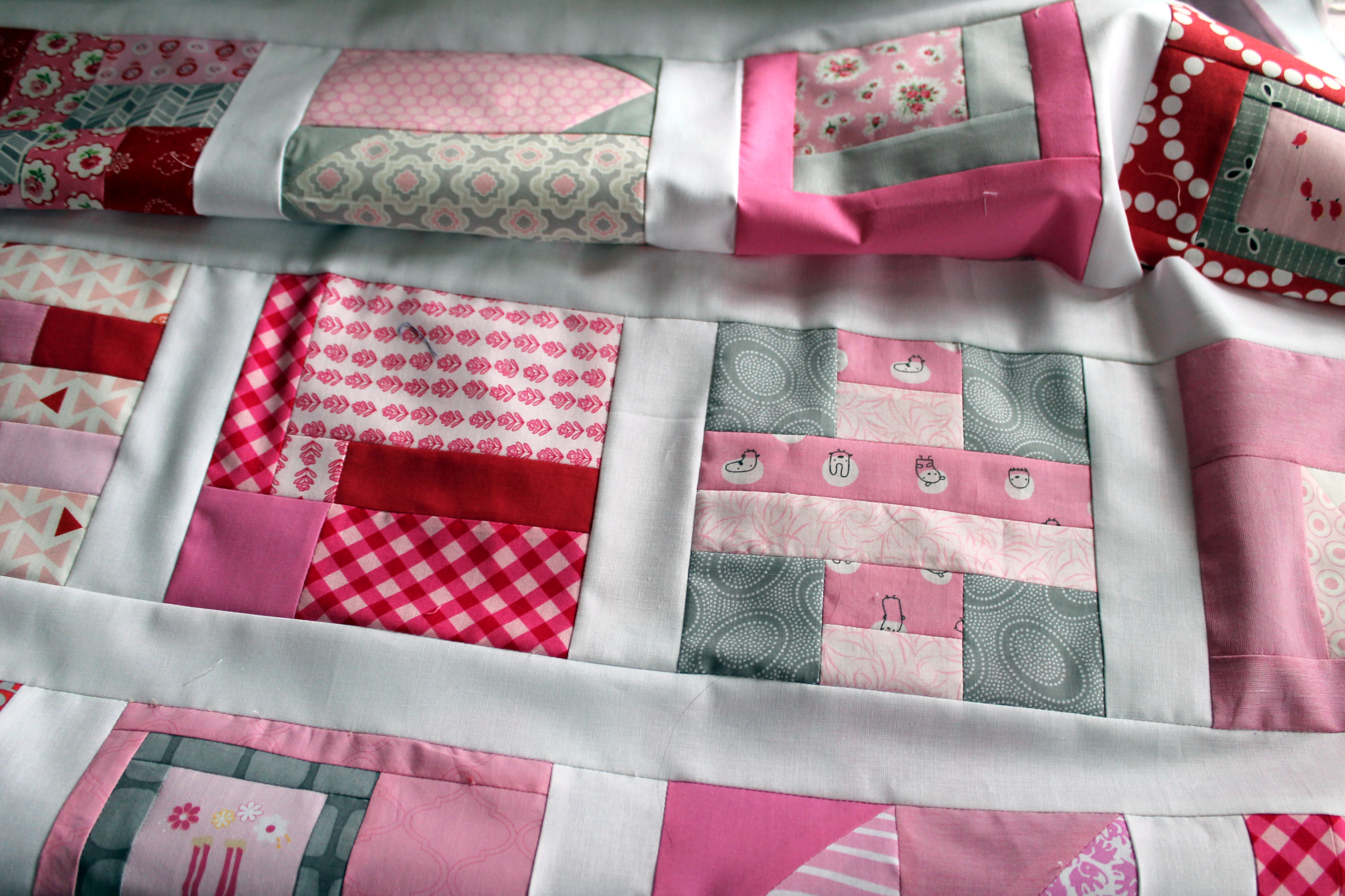
I thought a blue Tula Block would work but it just did not seem to have the same impact as a Tardis. In the end I have chosen to go with all pink blocks. I have added 1 1/2 inch sashing around the blocks and I am slowly sewing it together.
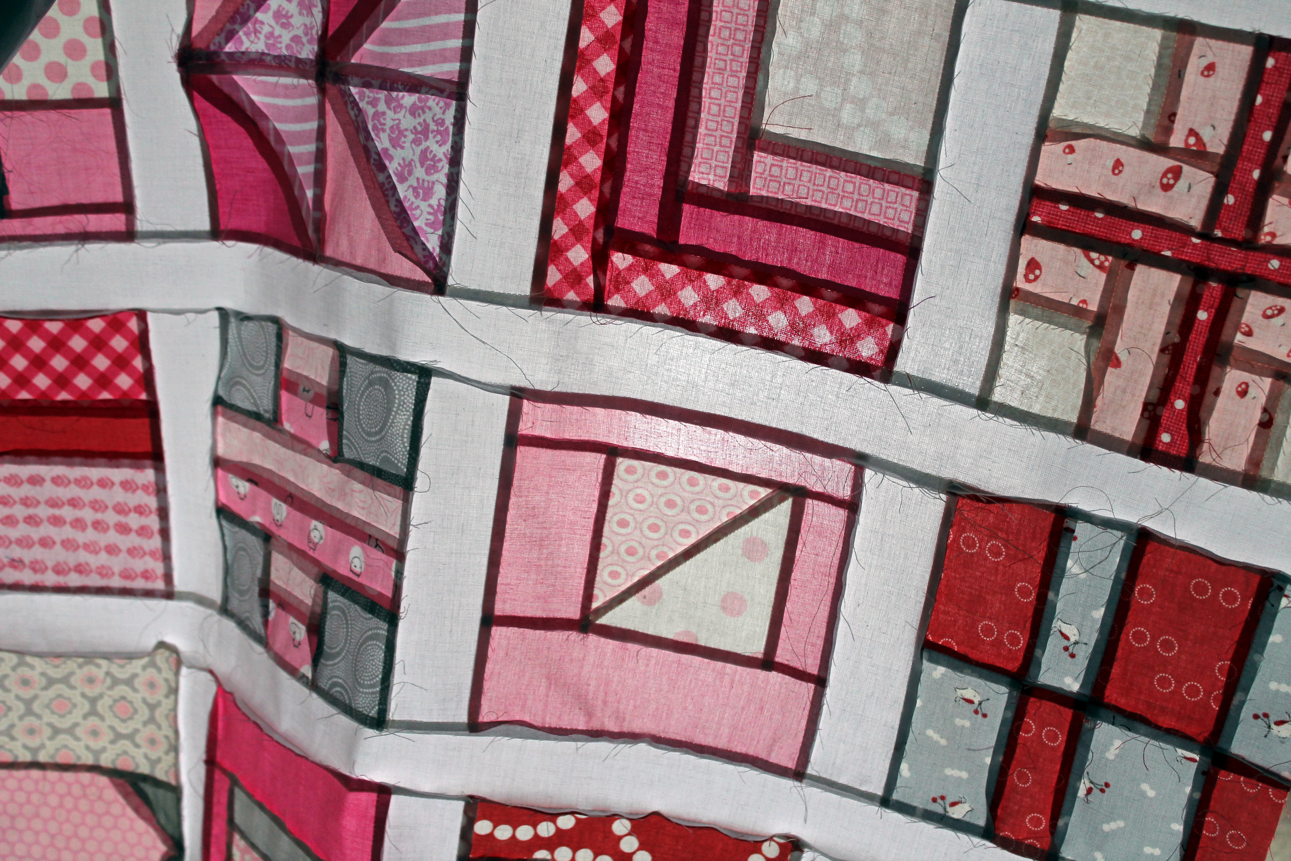
I have two more rows to go and before the top is all pieced…
As I add each row I keep thinking “should I add the blue”. I am constantly second guessing my decision.
I am loving the pink blocks together but there is something missing. AUGH… this is driving me crazy. What would you do?

I rather liked the blue tardis! But the pink blocks look great, too. Perhaps a pink border would like nice?
problem is the tardis is a single object and very prominent in the block….while the blue tula block is multiple pieces and not as prominent???
I am liking what I see in the photos though….the white sashing is great and breaks it up appropriately. 🙂
You are so right about the Tardis. Maybe I should make a Blue Tula quilt and drop the Tardis into that.
I know this suggestion involves a little unpicking, so feel free to throw things at me, but what if you put a few tiny scattered blue blocks in the sashing? Or unpick one or two of the blocks and add a teensy amount of blue. Not a whole block, but just a little sprinkle of unexpected.
I love the idea… but I am way to lazy. I think adding a scattering of blue to the sashing would have worked nicely.
what if you incorporated it onto the back somehow? a lone (blue) ranger? 🙂
Oh I love that idea. I will see what I can do. Thanks.
I really like what you have going on with the pink. Maybe all it needs is a funky binding color? I do love that Tardis. I think it would awesome in the Blue Tula quilt as well.
Can you bind it in blue fabric, that has a pink design on it. or vis versa perhaps. A very pretty quilt
I love the look of the pink. Maybe all it needs to spice it up is an unexpected binding color?
WholesomeMidwestern has a great solution there…I love the idea of it on the back!
Hi! This is beautiful and not too pink for me because there is lot of white and some grey. I don’t know how you plan to quilt and bind it, but you could use for the quilting and binding dark grey, red or something something totally different for ex. orange. x Teje
Teje I love the idea of adding another colour element with the quilting process and extra love the idea of the grey. Ummm lots to think about.
I’m happy if I gave you ideas to think. It’s not easy to help anyone with these things as we all have different taste and different Fabrics stash. Fb just suggested to me some beige – no beige in my stash… x Teje
Comme elle est trop jolie, cette courtepointe rose!!!Et j’aime beaucoup les bandes blanches qui rehaussent les blocs!….
Superbe!
Douce soirée!….
Merci. J’aime le rose aussi et pense que je vais le garder simplement rose.
I often find myself yearning for a pinky pretty girly fabric, soft roses, toile , floral type quilt and when I made it……meh! Sometimes samey, samey is a wee bit dull, whack it in there you know you want to. ( sorry if this advise causes more consternation)
Blue tardit!
hey, i would go with a colourful binding as well, but the (dark) grey is also an appealing idea… The pink blocks with the white sashing look great – I would not worry 🙂
Personally, I like the one blue Tula block, but that’s just me. I like it; not saying I would actually do it. And I vote to add the Tardis to a smaller project…
I love it as is, but the idea of a blue binding intrigues me, or maybe just a few feet of blue in the binding. Such creative ideas here.
BB
The way I see it, your husband added the tardis, sometimes we over look those special, fun moments. For me that’s a memory every time I would look at the quilt, and it would make me smile. I would happily leave it in the mix, its unique, whimsical and special, and on the back a little patch for why its there. 🙂
Put the Tardis back in! There’s no rule that says it all has to be Tula pink, is there? Or at least, only one you made for yourself. It’s fun. It’s cute. It made the Husband laugh. It’s the sort of thing he’d do, too. And blue binding, to bring the whole lot together.
This looks great with the sashing! Why not make the tardis into a cushion, to sit beside the quilt?!?
i love this… and I love the Tardis. But I love it as is- and what about the idea of a bold binding?
How about grey or red?
I love Teje’s ideas. I was thinking a deep raspberry pink coloured border but as there are greys in the blocks perhaps a deeper shade of grey border would work well too? A bit of fabric auditioning is probably needed. Don’t think I would try blue but deep lilac or orange might look good too.
Hi!!! I love all ways!!!! But wouldn’t putting the Tardis in there make it more you?!!!!
Very, very pretty. I love all of your pink fabrics, I don’t have very many. I do love the Tardis block! He may have been onto something there. heh
I love the pink. If it were me, what I’d do is add a pop of strong color on the binding. How about a bright orange (print or solid)? It would work with all the different shades you have – just don’t make it too pale. Great job on the quilt!
I love the pink but I am a pink girl. I do like the pop of blue but maybe for backing instead?
I love the all pink look – maybe a pink border (and grey binding?) Must start sashing my version….
Your husband definitely poisoned the well! Someone suggested a grey border. That would be fun, but I really like the suggestion for using a blue or blue/pink print. It would jazz it up a bit…and definitely put the Tardis on the back. Good luck!
If there’s no tardis, I like it all pink. 🙂
I dont think you can really go wrong – the piecing is stellar an the fabrics are exciting!
I like the idea of incorporating some blue into the back or binding. I like your version of this quilt – it’s so different than others I’ve seen!
The all pink quilt looks totally awesome. I think all that is missing is some awesome quilting to pull it together.
I think the tardis looks cute there…but I tend to agree with you. If you were making the quilt specifically for someone that loved pink and Dr Who, then it’d be perfect. Maybe you could use a contrasting thread to add a little something? Or unexpected color of binding?
Tough call. I’m just saying whatever choice you make will be good.
I like the pink blocks – they aren’t all pink so it looks good – I do like the idea of putting the tardis on the back ! having said that I’m just about to quilt a pink spiderweb quilt with pink backing, pink thread, and using a pink binding so maybe I’m just a bit pink crazy !!
I must admit I feel that you can never ever have enough pink.
I love the Tardis, but I am also a huge fan of pink. I like it as is. Dark pink binding, perhaps?
A pink tardis!
I like the way you think…
I would leave out the blue. It looks great with all pink blocks and the white sashing. :o)
I am in the process of making all of the blocks in the book. It is quite the undertaking. I LOVE your pinks and would not change a thing. I think the quilt look perfect all pink.
The Tardis doesn’t ask permission to show up – it just appears – so leave it in! Pink world or not, the Doctor would appear.
I love it…we both laughed out loud at your comment.
I think you ought to save the tardis for a quilt it fits it in with. and then use blue thread for your quilting as a nod to your husband’s design input. Another subtle color (like blue thread) would add a layer of interest to an already-great top. I also like the blue/pink binding idea–it would really make it pop.
Nice Work!
I think I have come to the same conclusion. After staring at the quilt for a couple of days I am embracing the pink and planning a quilt that the Tardis block can “appear” in.
I would totally totally add the blue, but I’m sure it will look wonderful either way. 🙂