Last week I said had a Cotton and Steel…and to prove it here is Exhibit B….
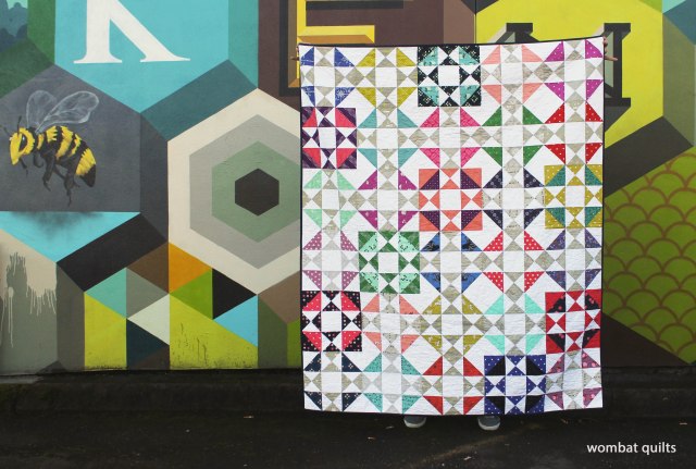
This pretty little thing was made using a pattern from V & Co called Hop Skip Jump. It is just one block but two different color ways to give the scattered affect.
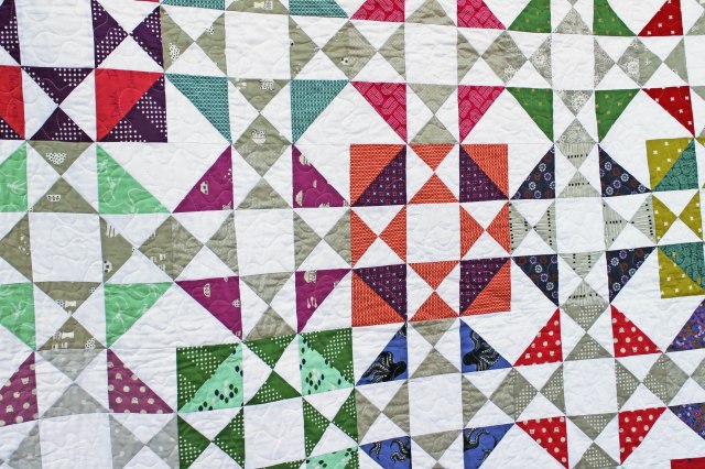
The prints are all Cotton and Steel prints, of course with Kona Snow background….
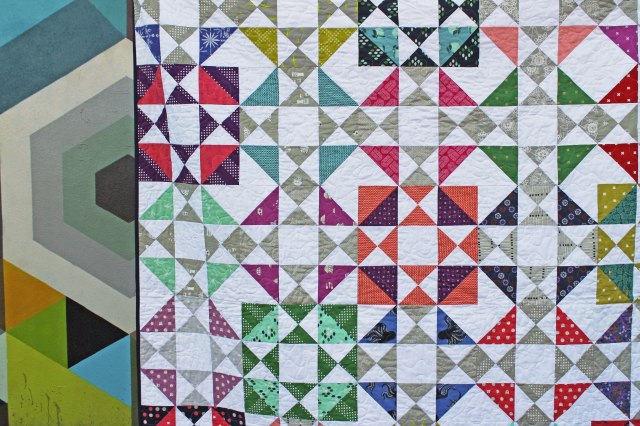
The block is made up of half square triangles and broken dishes sections…. I became quite proficient at matching my points by the end of this process. I may have cheated a little by using glue basting to match my seams for the broken dishes section of the block… but don’t tell anyone!
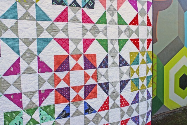
What I really love about the Cotton and Steel selection in this quilt is their “kind of grey” color that they use. It is not quite a grey and not quite a bone color. It is really a unique color shade that they use over and over again in their prints. I must admit my stash of this color took a big hit with this quilt particularly because…
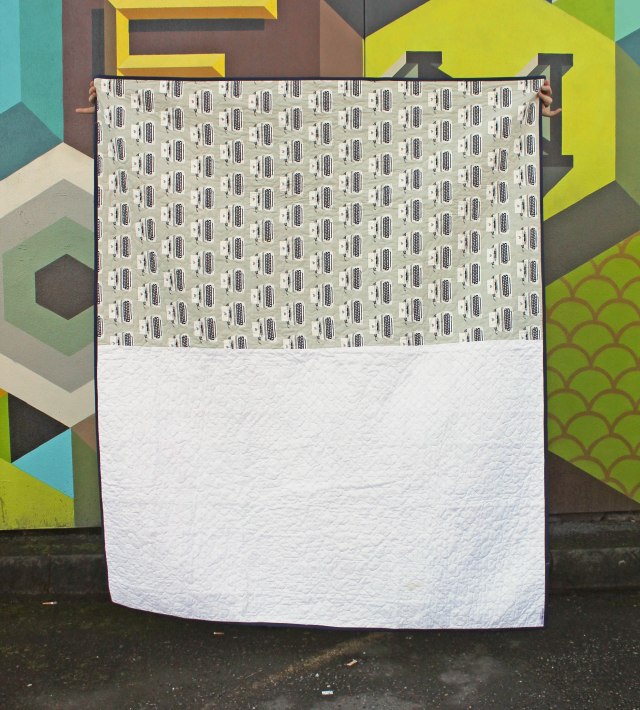
I used a swath of it on the back. This print did not work in the block so I kept it whole on the back. I know the typewriters are the wrong way but I love them anyway… and as always the kid that gets this quilt is not going to care at all.
QUILT DETAILS:
Pattern: Hop Skip Jump by V & Co
Fabric: Assorted Cotton & Steel prints and Kona Snow
Finished size: 60 x 72 inches
Expert quilt holding: Mr Wombat

Beautiful! Love the pattern. I’m going to have to look for it now.
It is a great little pattern and it comes with three different finish sizes which is good. You can get a PDF download version on the V&Co site… http://vandco.bigcartel.com/product/hop-skip-jump-quilt-pdf
Finding a great grey tone is so very hard! Thanks for sharing this lovely quilt.
I have struggled finding a grey I like…and find doing scrappy grey things difficult because they tend to read either warm or cool with very few neutral toned ones. The Cotton & Steel grey is a good alternative.
I love it.
Great finish! I love that cotton and steel line too! I’ve got a pretty good stash of it . got to go look at them reight now, tee tee. Thanks!
Claire I am loving mixing all the fabric lines together. It really does all work in harmony.
Your work is beautiful!
Thanks Dawn.
How wonderful. I think I need to save this for a future project. I did something similar with the pattern Contrary Wife.
It’s gorgeous, and I particularly like the scattering of reversed blocks, which remind me of fruit flavoured lollies called Spangles, a favourite of my childhood. I think you should patent some quilt-holding clips shaped like hands with Mr W’s trademark ‘pinkies aloft’. So much more interesting than bulldog clips…
I have been mulling over a quilt similar but only in my head, thanks for the lovely vision for me!! Its just wonderful!! I am a total Cotton and Steel junkie too.Do you have a name for the grey color? Thank you, adding you to my blog “saves”.
Diane they call it grey but it is not quite a grey. Most of the prints I used were from their Black and White collections. They do a true grey but this colour has a bit of brown/bone in it and they call it Cloud in their basics line – Dottie and Metallic Notorious. Hope that helps.
Grey/gray is tough! I really like this pattern. Thanks for the intro to the pattern and the “grey”!
Gorgeous, love it!
So pretty! 🙂
Love your work!! Colors are fantastic together! Another wonderful finish!!
I’ve been following your blogs for several years, love your style, & your quilts, but mr. wombat’s pinkies add the finishing touch!
Valarie he does like to think he adds class to the proceedings. Lol.
What a gorgeous quilt. I love the pieced backing also.
I love the quilt! the collections really do look great together and don’t get me started on the mural you used for photography… Also thanks for the pattern idea/link. xo
Pingback: Working through the backlog…. | WOMBAT QUILTS