I finally finished the binding on my green and grey quilt yesterday.

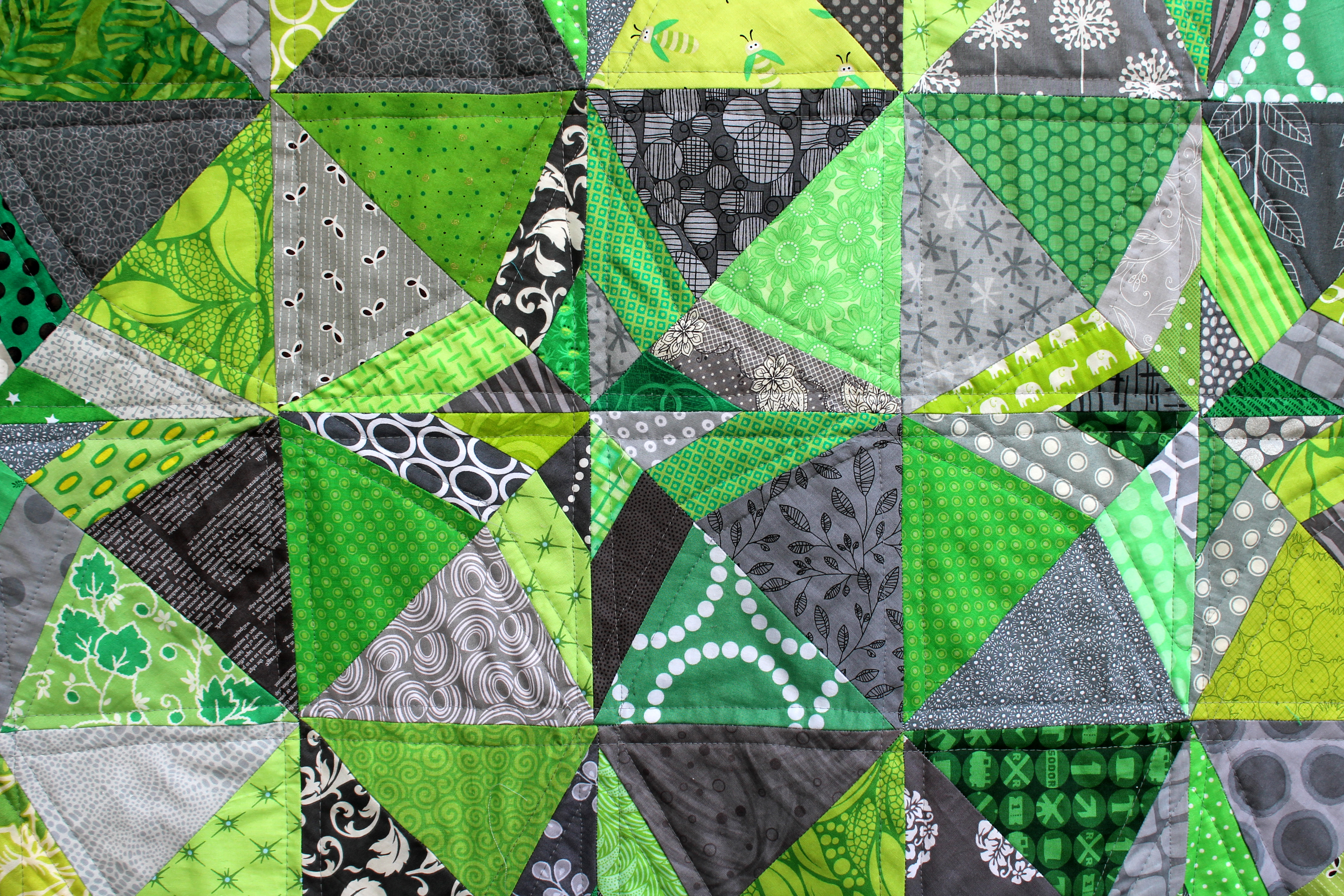
The quilt did not quite turn out like I envisioned it but I am pleased with the results none the less. When I started making the blocks I thought there might be more stronger contrast between the grey and green so you could clearly see the pattern of the star, but alas it was not meant to be. Instead I think I have a quilt that you have to search harder to find the repeating pattern, making the whole thing more interesting. The finished quilt is 48 inches by 48 inches, just the right size for a kids quilt if you ask me!
If you are interested in the start of the process for me, and links to the pattern you can find my older post here.
At the end of the process I had an extra block (my maths is not what it used to be) so I decided to use it on the back.

I played with a couple of different bindings (scrappy, grey and green) and settled on using a Kona solid I had in my stash. I continue to be amazed at how something as simple as a binding choice can radically change how your finished quilt looks. The solid bright green just gave the quilt an extra pop.

It would be interesting to hear what you think of the finished quilt. Does it work for you or is it too muddy? I really value the opinion of my fellow quilters/artists out there.

I love it, and I don’t think it’s muddy at all. I love how it doesn’t quite resolve to stars because of the differences in color depth that you sort of can’t take in simultaneously, but that gives it all a twinkliness. I’m a huge fan!
You are right about the differences in colour depth/vale. I had not realised that that was why the pattern is not as clear. Thank you for your pov. I am looking at my latest quilt and realising it has the same issue. I would have to give us the scraps to make the quilt pattern clearer, which is not going to happen any time soon.
I love the indistinct look of the stars. If they were crisp and structured I don’t think they would appear to bend and turn as they do. Very cool! The binding and backing are great, too.
I went to the original pattern and thought ick! Why? I had to think about it for a minute. It was your use of many different grays and greens! The two color ones were not near as exciting. Yours is awesome!
Thanks for the kind comment. I am really enjoying taking older patterns and making them feel modern.
Wow!! This looks incredible.
I love this quilt, made me smile!
Thanks. It was fun to make and the colours turned out so different from what I expected. I like happy accidents.
It’s really striking – like tropical foliage. I think the low contrast thing gives it a lot of movement – so it’s an exciting quilt.
that’s great – such a striking block!
I like that the green and grey blend, it’s more soothing that if they had had a strong contrast. And the binding green is perfect. Love it!!
The green quilt is freaking gorgeous