I am constantly amazed by what inspires me – where ideas and colour combinations for a quilt come from. This week’s work in progress is a good case in point.
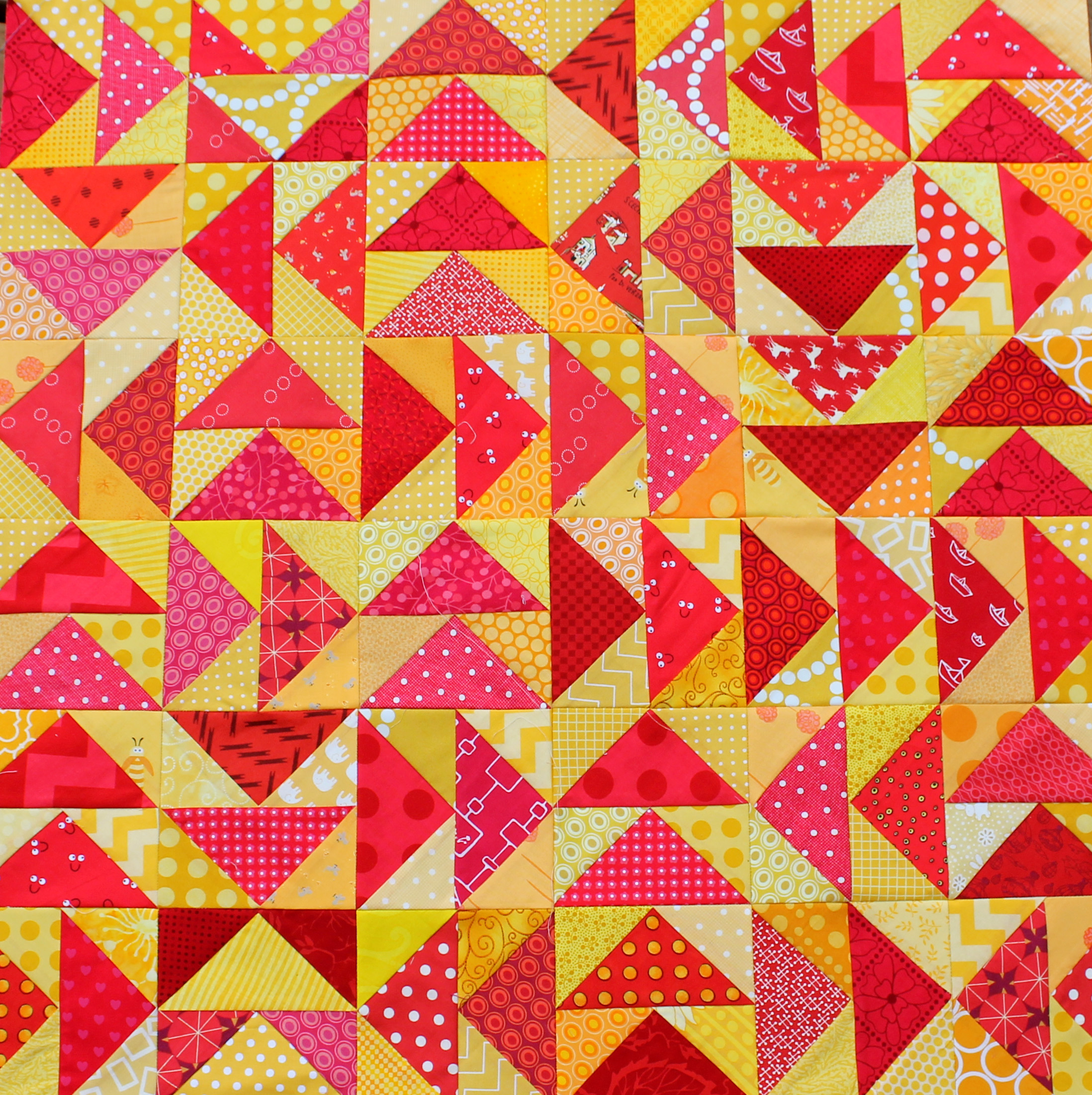 This bright scrap quilt was inspired by my local petrol/gas station logo.
![]()
Strange I know, but I was filling the car up one day and realized I really love these two colours together. I promptly came home and pulled some scraps and made up this block.

I originally posted about this flying geese pattern back in April this year. You can find the original post, with a free paper piecing pattern here. A couple of months later and I got the urge to finish this quilt top, so I pulled fabric from my stash as well as from my scrap pile and started work.

Now I have a stack of blocks and I am gradually putting the top together.

My placement is random and fun and I have thrown in a couple of reverse blocks to break things up. It is kind of fun making the arrows go all over the place.

I have also been thinking of making some yellow arrows with yellow background, but I am not sure about it. Any thoughts?

Great inspiration 🙂
Thanks for stopping by my blog, funnily enough, every time I pixelate something to hide it on my blog, someone says I need to make a quilt out of it, and I always agree, and then promptly forget… *ahem*
I am happy to remind you… or I may just “borrow” your image and make it myself. It is sooo cool.
I’ve had this color combo in my head for awhile – ever since I saw a Brandon Mably print I loved. Love your interpretation!
Proof that inspiration can come from anywhere… So great! Love the flying geese and how you mixed things up.
I don’t have patience for geese anymore but I love this.
I must admit I paper piece my geese – it is the only way I can do it.
My geese always turn up wonky, I might have to try paper piecing them because yours look amazing!
What a great combination. I love the colors and love the geese in all directions. I would have to try the yellow ones and see how they would work. Fun how inspiration can hit and I love that you follow it. I normally get side tracked or have too many running through my head. Can’t wait to see this!
I agree with Beth, try the yellow geese in one block and pin it on your wall — you will probably have a gut feeling if you like it ;))
Gorgeous block, it’s funny how things can strike you like that. I had a similar experience the other day when looking at bottles in the bathroom..it was lemon and pale blue for me. Now I really want to make something combining those with a mix of greys! Your block is much prettier than the shell sign it has to be said!
I love the idea of lemon and pale blue mixed together. I may have to try that combo too.
Fun! It’s looking great and I agree with the others about giving the yellow geese a try.
Those colors remind me of a tequila sunrise. I wouldn’t turn down an offer for one of those beautiful drinks right about now haha
Love the color combination! It’s going to be gorgeous!
Never have the Shell colors looked so good! What a fun project. My instinctive reaction to the yellow geese is, No. But Elizabeth Barton says visual design should be tested visually, not mentally, so I agree with everyone who says make a couple and lay out a block and see what you think.
Well put. I do need to actually see how the yellow geese look in the quilt. I am going to whip some up tonight and see if they work.
these are such great colors together Cath! I love the varied directions of the geese too!
🙂 Kelly
You are always thinking, aren’t you!? I love it and was so surprised that the Shell sign was where you got the idea of red and yellow together! Your geese are perfect… And your scraps are scrumptious! Thanks for sharing, Cath!
You’re a quilting genius. Just thought you should know.
Awesome quilt, and hilarious inspiration! Did not expect that.
My husband would love it if I got my inspiration from things like this. He loves all the petrol station signs and old oil can memorabilia type things.
Love it! And if you hadn’t posted the shell logo i would have never guessed that this is where the inspiration came from! Awesome 🙂
two of my favourite colours!! Love the fun arrangement of the geese too.
Improve flying geese always end up looking so amazing. The reverse geese definitely make everything pop.
I think a couple of yellow arrows with yellow backgrounds thrown in the mix would look incredible! I mean, it already looks gorgeous, so it could just add to it! 🙂 Can’t wait to see progress!
Beautiful! I love the coral you put into this as well. It really pulls the whole thing together and helps expand the color range.
Pingback: Pastel Paper Piecing Monday Block 2 | Wombat Quilts
I wrote a comment but it seems to have gone missing. Just saying that your sense of color combinations are awesome, you manage things I would never have dreamt of. Like turquoise and red…..and this one. Think I need a different pair of colored glasses LOL.
I think I might have tried this on the wrong place ;-o
But what I said was – I get so inspired by your free colored spirit and how you combine colors. Some which I would never had thought of – like the dark red and turquoise and this one. Simply stunning
Love it! I enjoyed seeing your inspiration and your finished product!