The last week or so I have been playing with a different kind of colour combination…one that really has not got a lot of “colour” in it. My inspiration was a very old photo that hangs on our living room wall…
 (Please note..I can neither confirm or deny that I am in this photo).
Anyway I have always loved black and white photographs, which really are more grey and white than black and white, and thought why not play with greys in a quilt. The end result was this block…
 I used another fabulous free paper piecing pattern from Quilters Cache called Atlantic Sea. The block pieces look rather strange and a pattern is not immediately obvious.
 But when you put more and more of the blocks together you get this wild, slightly mesmerizing pattern.
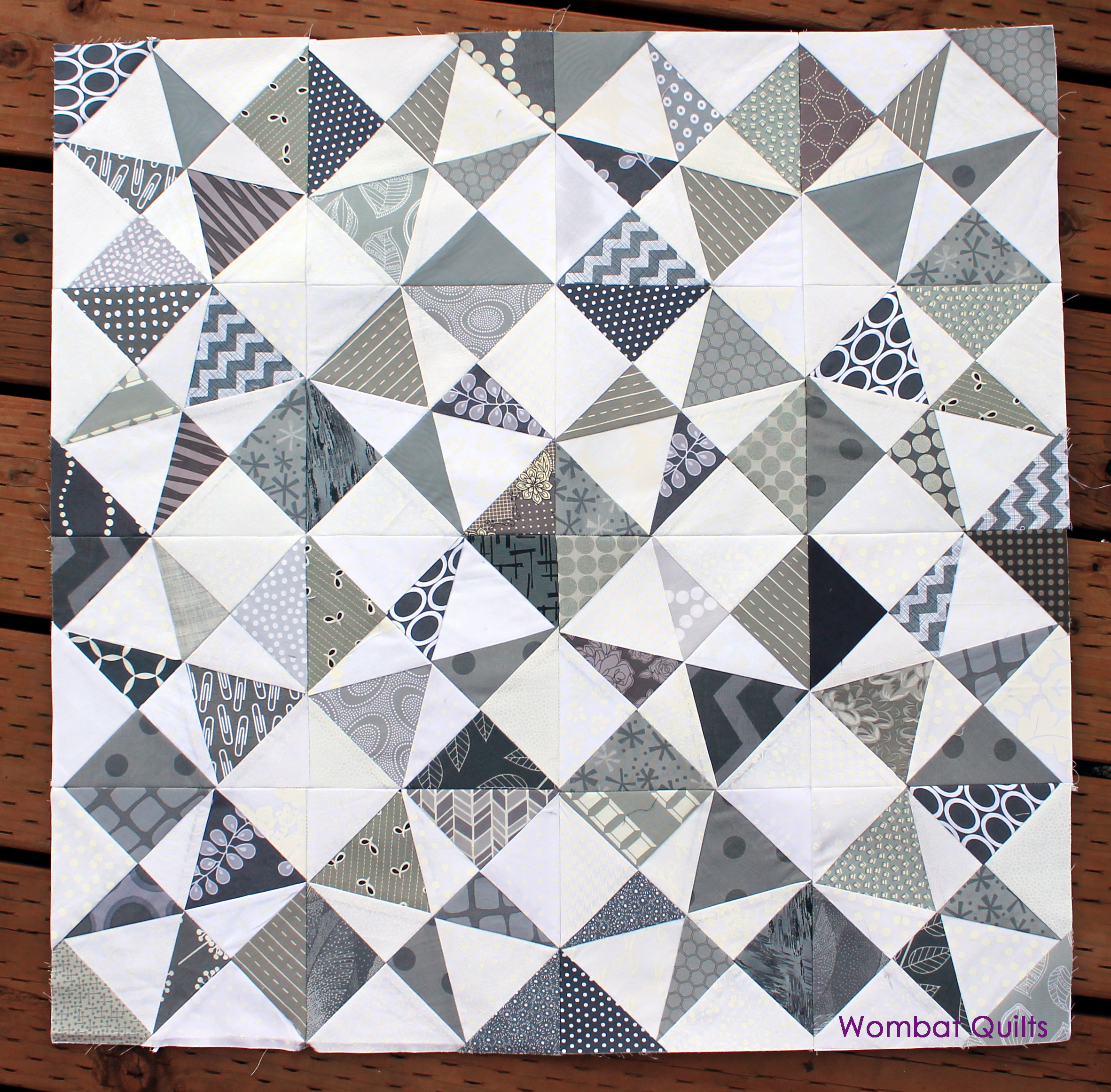 I think as this quilts grows more and more patterns and shapes will become visible. It is really a little trippy but cool.

Oh Cath! This is so very striking. And just goes to show just how interesting even the cloudiest of colors can be with the right touch ;o)
Oh, j’aime beaucoup cette harmonie de tons gris, très à la mode….Et ce motif est très, très interessant…Très joli!…
Merci beaucoup. J’aime comment ce modèle est à venir ensemble.
It is awesome, love the B&W!
That is very cool looking! I do envy your fabric stash 🙂
My stash has been years in the making Lynne, and I must admit it took me a while to find my fabric voice, but now I know what I like and what I need and so spend my limited fabric budget wisely…most of the time!
This really underscores the importance of value. You’ve done such a great job with your placement. It sparkles.
Thanks. Having seen the photo I realised I needed some a smattering of more dark darks. It was a nice exercise to step away and look at the wip objectively.
This is a beautiful start to a stunning quilt! Can’t wait to see it grow! I understand about stepping back and looking, got a quilt top together last week and on the 20th time I walked in the room where it was layed out I realized (1) yes (ONE) block was upside down…. GRRRRRRR
I say go with the the upside down block. It makes things interesting.
Love the Glomar caption to the photo 🙂
The warm greys you’ve used help the eye move around it too. But I keep looking for a tiny scrap of pink!
Don’t laugh but I thought about it. Instead there will be a little scrap of blue/green.
Oh, OK, Wombat favourite colour #2!
Too funny. Am I really that predictable?
Not at all. But you do have your own particular style and preferred colour range, and it’s odd when your ‘signature’ is missing!
I was about to say the same, but for a little piece of red…
Cath, that little girl on the left has your exact smile???!!!???
Oh, and I love your quilt.
Busted… It is me back before wrinkles and grey hair!
Not so very different. If I take off my glasses, you look exactly the same!
Ooh, I really like that pattern – and the fabrics you’ve chosen really make it move!
I first block I was kinda meg about. But the four put together is wow! I love how there is a negative block/star in the center. Very cool.
that is a very cool quilt in the making. Love your inspiration
Now that I like a lot. Interesting how the pattern/angles change while you look at them….:)
It is crazy. I spent about 15 minutes yesterday just staring at these blocks looking for an over all pattern.
Love your blocks, always an inspiration!
These are beautifully intricate when put together, I love them! All of your blocks are so beautiful and inspiration, reading your blog is really a pleasure!
Thanks for the kind words. I am glad you like what you see/read.
Fantastic pattern and the fabrics used make it look so wonderful ~ love the extra blocks you get when you put 4 together! Beautiful!
That is soooo cool!!
Absolutely lovely!
this is a handsome piece!
I love this!! I find myself drawn to greys and low volumes lately, too. I have neither the time nor the stash to REALLY play, but in my mind of “one day I’ll make….” grey is copious. You are a quick sewist!
I like this pattern. i am working on a grey quilt with some colors. I think they can be very dramatic. – Jim
I really do want to add a splash of colour to this quilt. I am finishing up a grey and white mini quilt which I added a touch of citron to and it just pops.
Oh my goodness. This is gorgeous! Absolutely stunning. I actually really like it withe just the greys and whites. It’s riveting. I’m not sure where you would put the colour that wouldn’t distract from the mesmerising pattern… I know it will look amazing when it’s done. It’s just so beautiful.
E xx
Sorry, I realised that having typed that, it might sound like I’m saying colour would be bad. I just really like the grey and the colour will pop because you have an amazing eye for these things, and I’m just digging myself further into my hole…
Foot out of mouth.
It’s beautiful. And when it’s finished it will be even more beautiful.
E xx
Too funny Erin. I have been uming and ahing about whether to add a splash of color. Today’s paper piecing Monday it was the same issue…and I went with a color splash but I think I might leave this grey and whit alone. I think you are right that it will break up the pattern flow.
Love! I’m now adding a grey & white quilt to my To Do list! Gorgeous!
This is great, thanks for sharing!
Pingback: The beauty of the Altantic Sea | WOMBAT QUILTS